

Concept 03 · Half Title · fictional brand
An editorial website for a publisher that doesn't exist
Half Title is a fictional London press for fiction, essays and poetry in translation, and its site is our study in editorial design. It is built the way a book is: a half title between pages, a book that opens as you scroll, and a reading room set like print.
- Style
- Editorial
- Industry
- Independent publishing
- Format
- Publisher's website
- Built with
- Next.js, Tailwind CSS, Motion, Lenis, Cloudflare
- Launched
- October 2026
- Live site
- halftitle.logicbeam.in
The idea
Publishers sell books on their covers and keep readers with their pages. Editorial design suits a press because it is the press's own craft: type, margins, running heads, the pages a book has before its story starts. So the site borrows the structure of a book rather than a magazine's grid. Between sections, a press sheet carries the next page's half title; a book's own page opens the book.
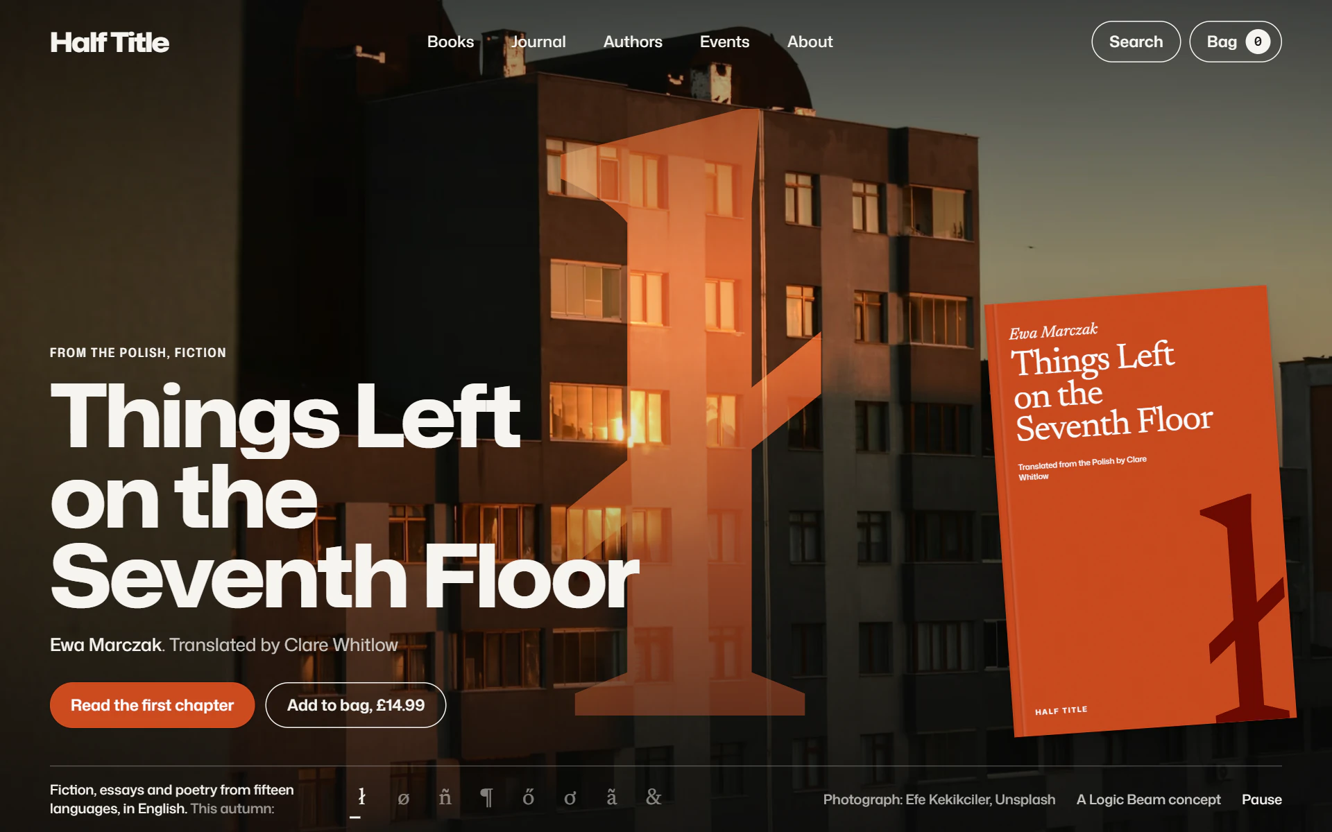
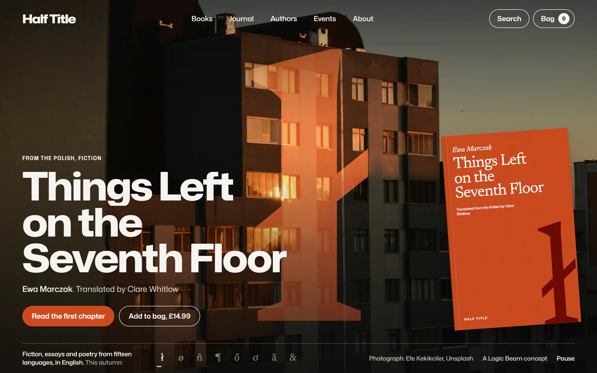
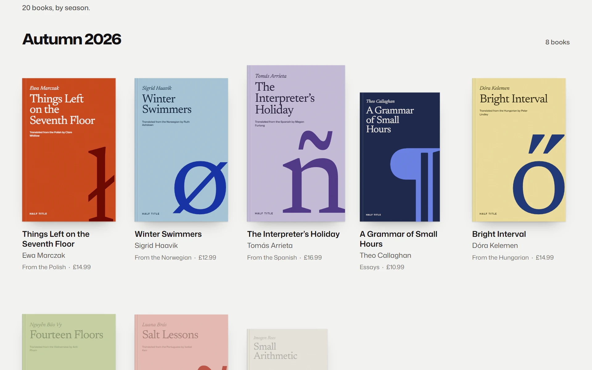
The press publishes mostly in translation, so the covers put the other language first. Every translated book carries one letter its first language has and English does not, ł, ø, ñ, ő, printed large in a second ink; a book written in English carries a printer's mark instead. That one rule designs twenty covers, and the rest of the site is built around it.
The press is invented — its twenty books, their authors and translators, the £14.99 paperbacks and the readings in six cities — and the site says so in its footer, its bag and the imprint page of every book. The writing is real: a whole first chapter, the first pages of seven more books and six Journal pieces, all written for the site. The build is the same code we would ship for a client.
What's on the page
Eight screens, one idea.
- 01
Every book, over the place it is set
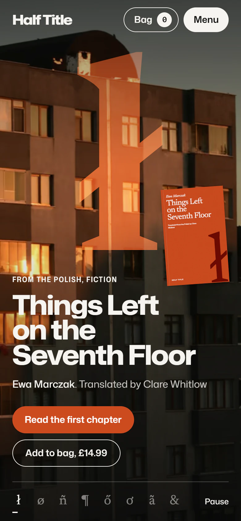
The home page runs the autumn list like a series of posters. Each book fills the screen with a photograph of the place it is set, its letter printed over the picture so the photograph's light shows through, and its cover leaning in front. The letters wait in a row at the foot; scroll, and they rise, and the Polish ł swells until the page is orange.
- 02
Open the book
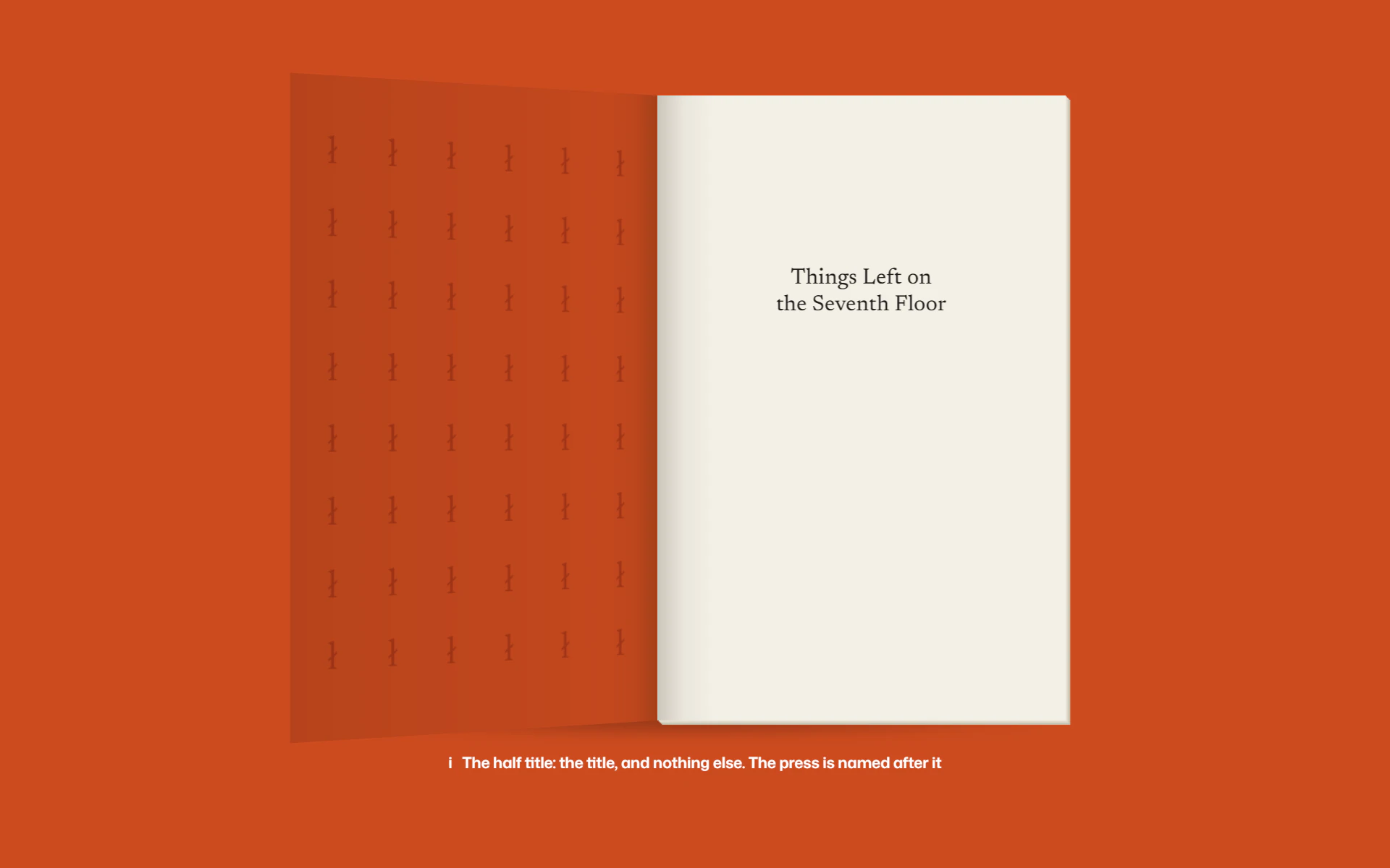
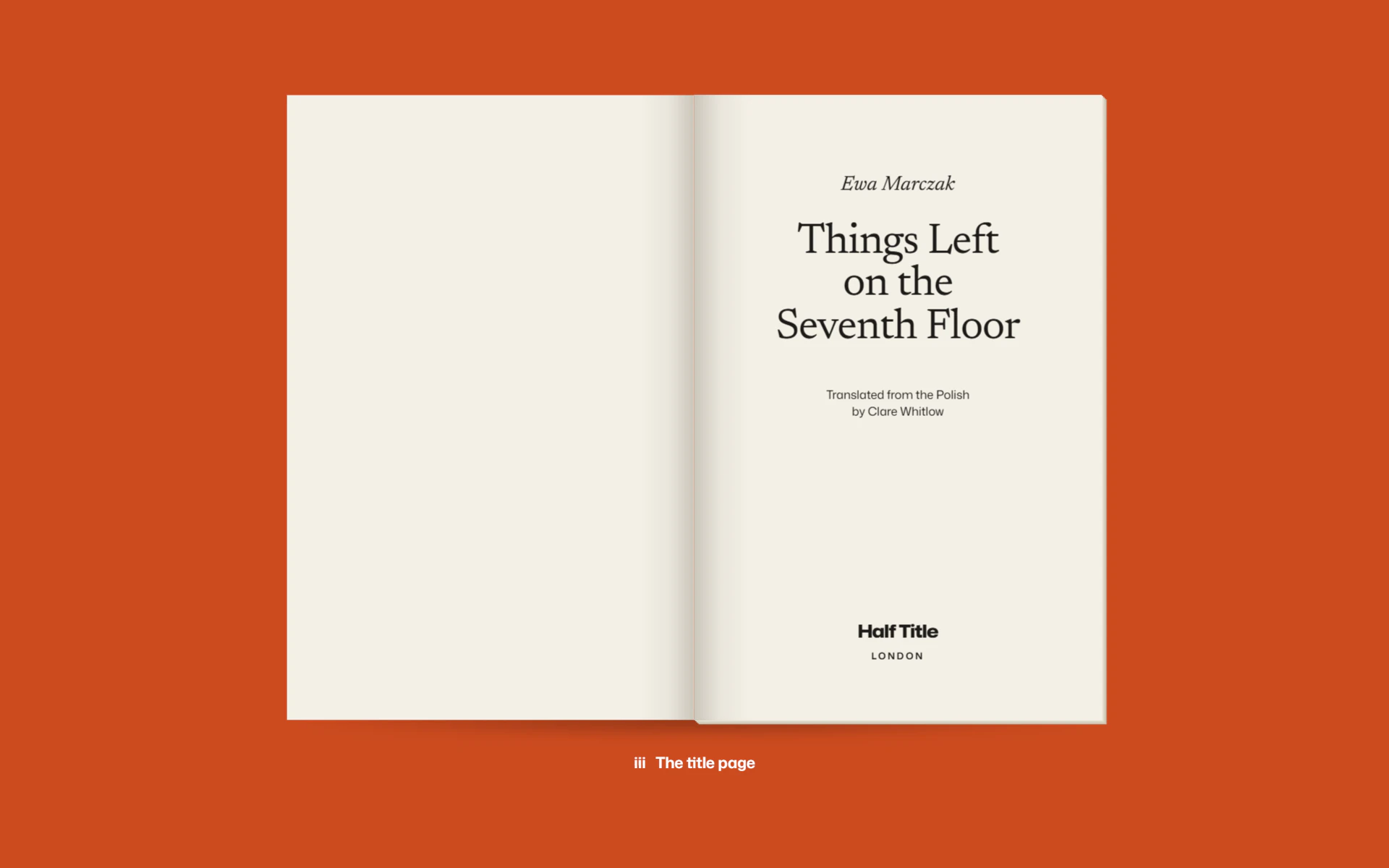
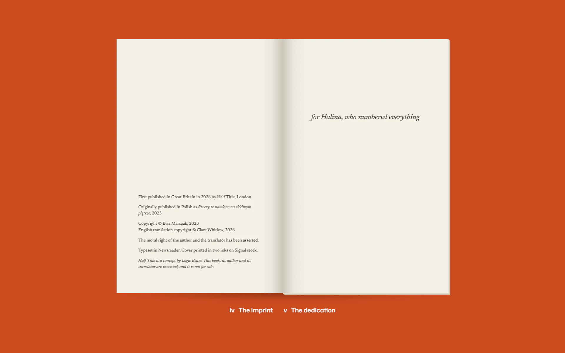
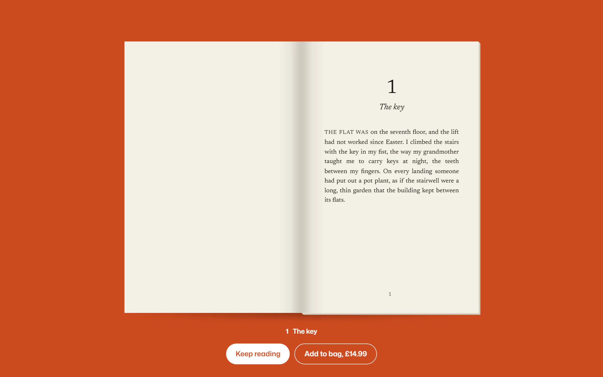
A book's page is printed on its cover's stock. Scroll, and the cover moves to the middle of the screen and swings open on its spine, and the leaves turn one by one through the endpaper, the half title, the title page, the imprint and the dedication, to the first page of the text. A caption under the book names each page as it comes.
- 03
A reading room set like print
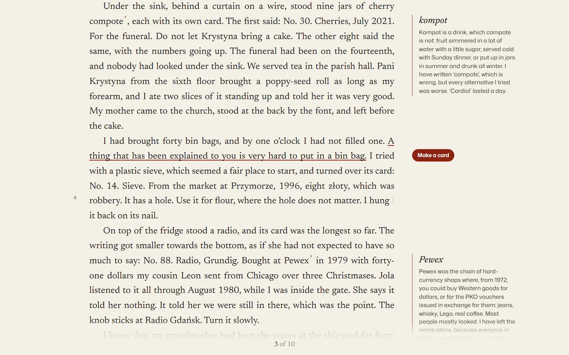
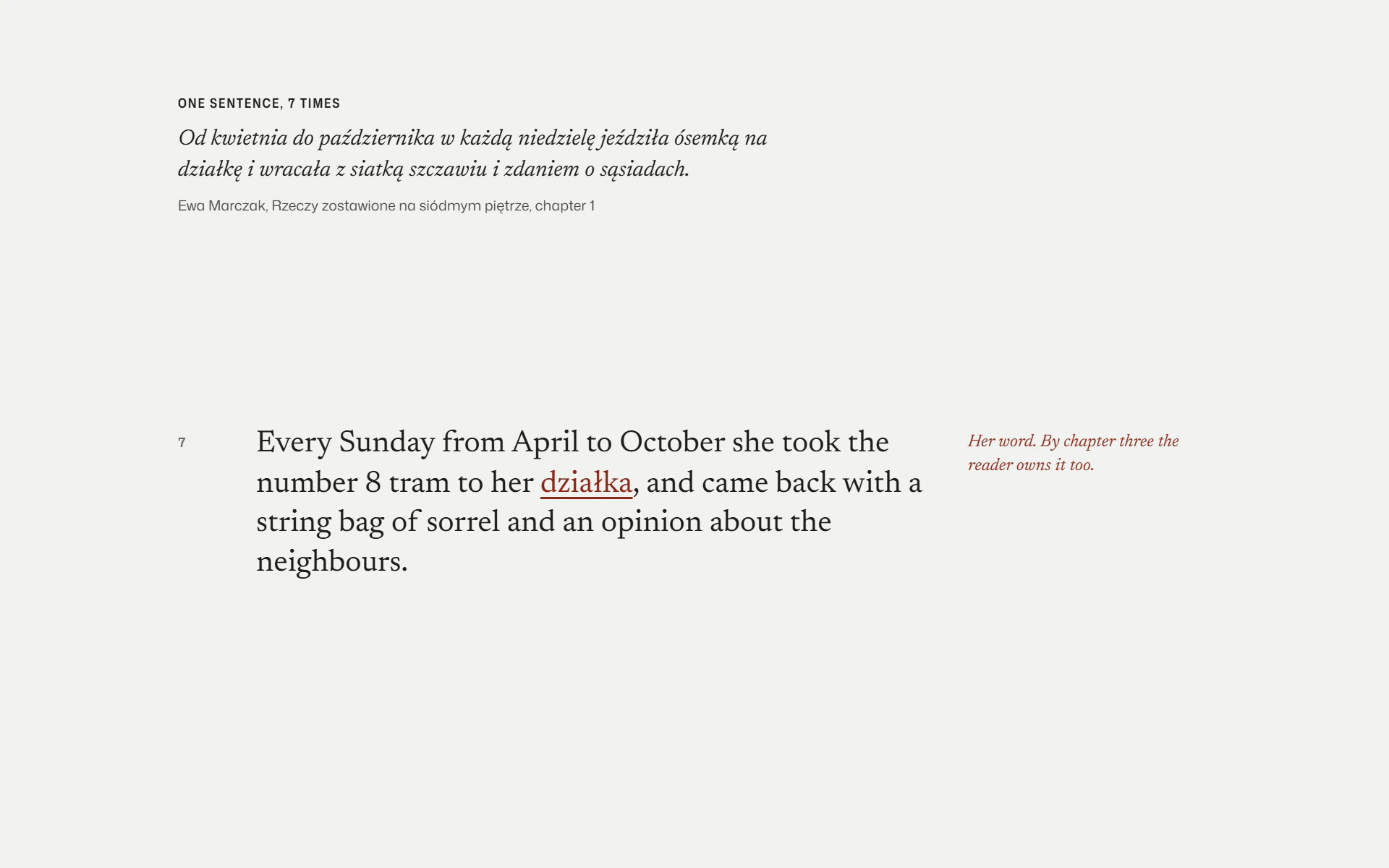
The whole first chapter of the lead title, and the first pages of seven more books, set as their printed books would set them: justified, indented, with the opening words in capitals and a folio that counts the pages. The translator's notes sit in the margin level with their lines. Three lines underline themselves in the book's second ink as you pass, and any of them becomes a card in the cover's design, saved as an image.
- 04
A Journal read through a lens
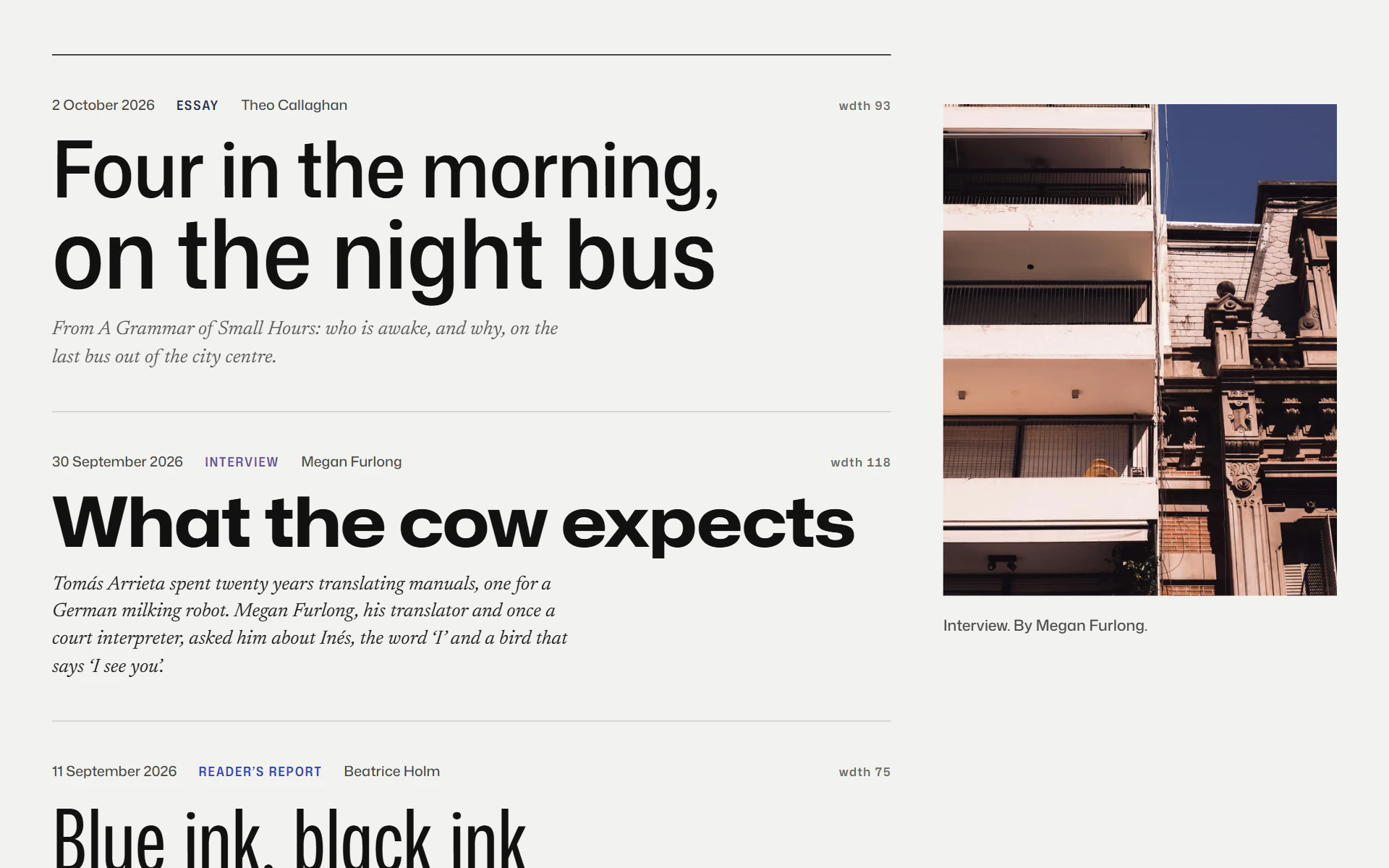
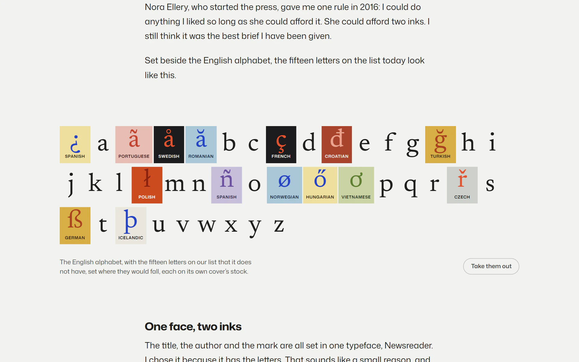
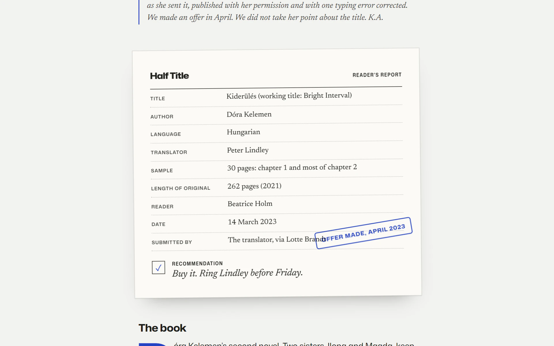
The Journal's titles are set in Mona Sans, narrow, and each one widens to the full width of its column as it passes through the middle of the screen, as a word swells under a reading glass. Four of its six pieces have a figure of their own: one sentence translated seven times and struck out, the English alphabet opening up for fifteen letters, a night bus route, and a reader's report with the press's stamp on it.
- 05
Readings, a day at a time
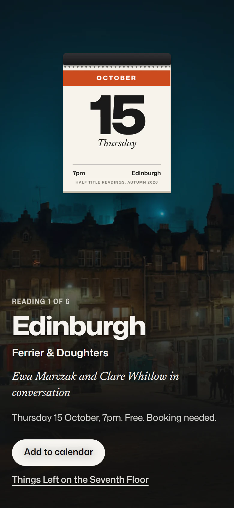
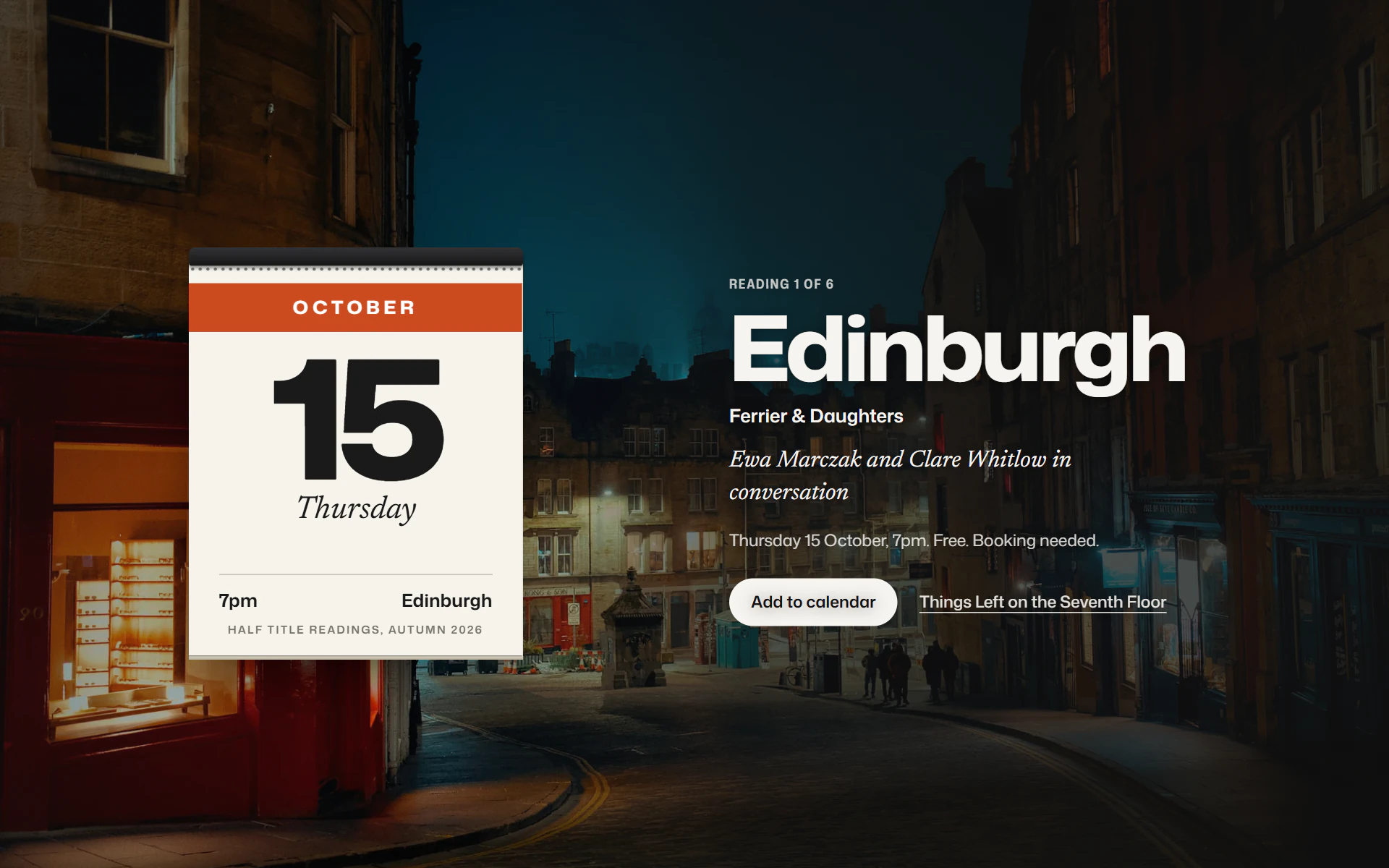
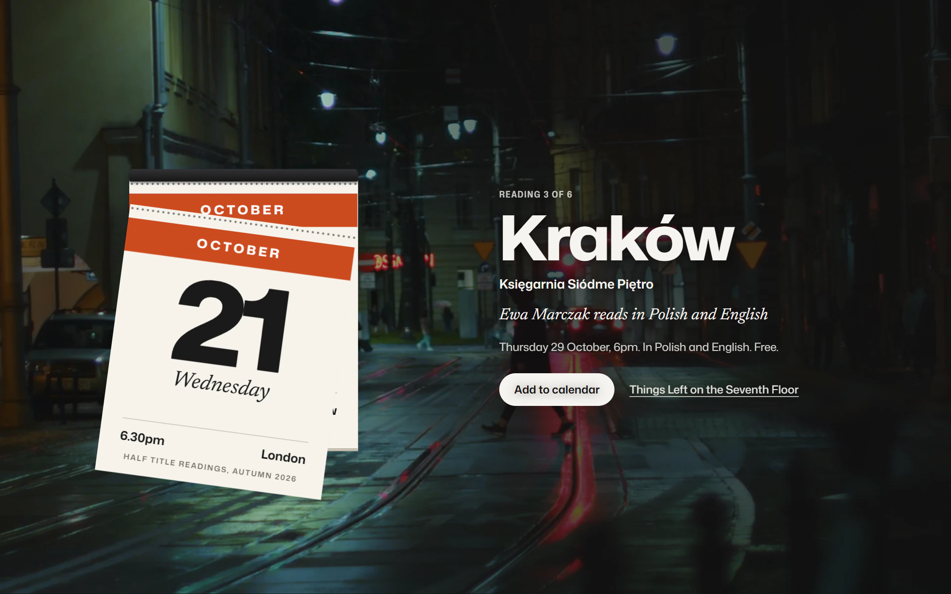
The readings are a tear-off calendar over a photograph of each city. As you scroll, the top sheet gives at its perforation and falls away, and the next evening is underneath, in Kraków, Bristol or Oslo. Every reading below has a real calendar file, in the city's own time zone.
- 06
A half title, pulled back
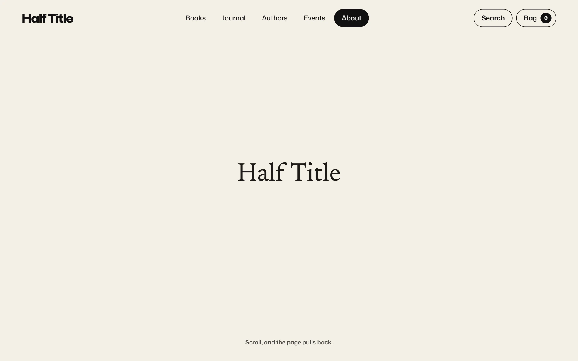
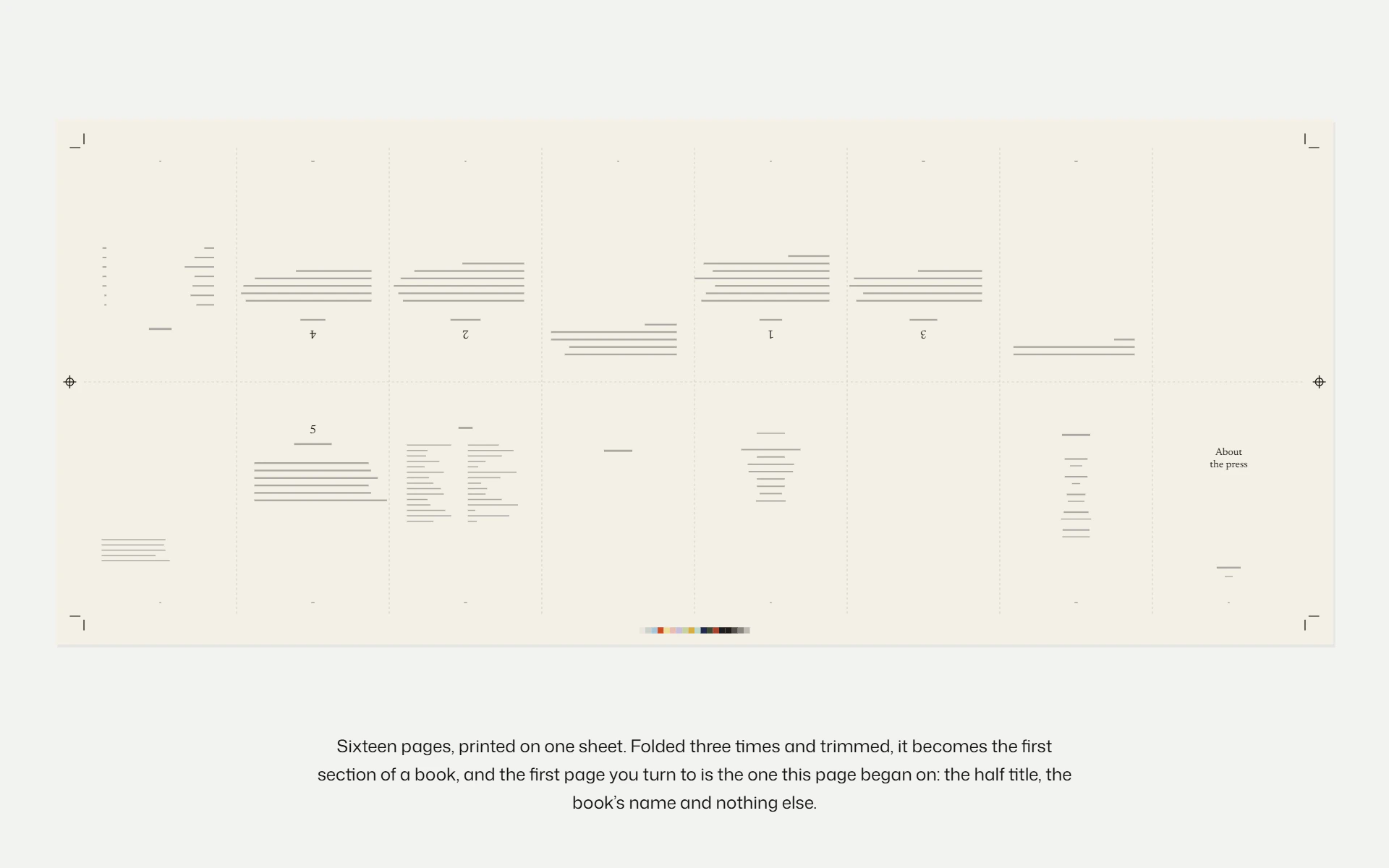
The About page opens on a half title, the press's name and nothing else. Scroll, and the page pulls back until it is one of sixteen pages imposed on a press sheet, half of them upside down, with crop marks, registration targets and a colour bar of the cover stocks in its margins, the way a printer lays out a book before it is folded.
- 07
And the rest of a press
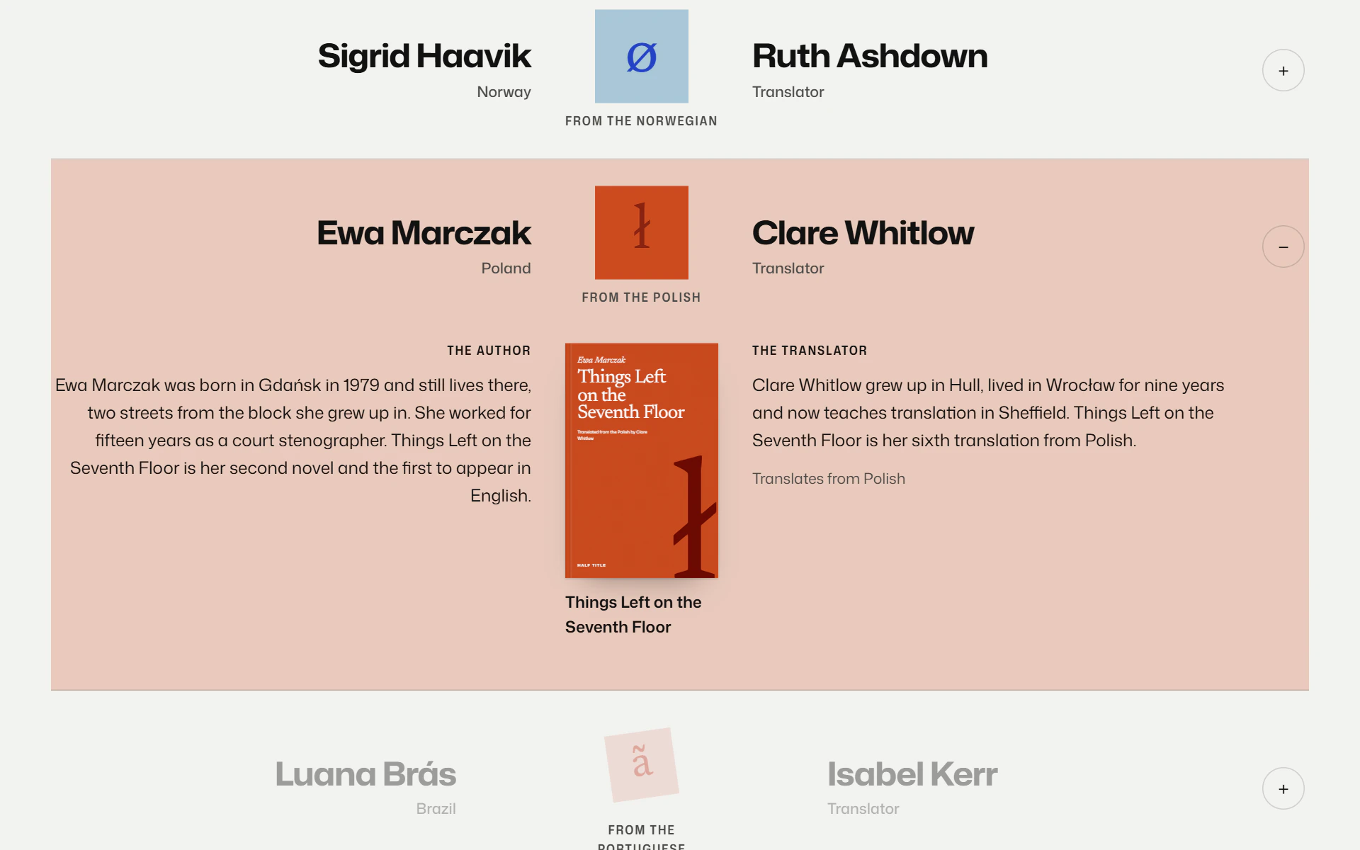
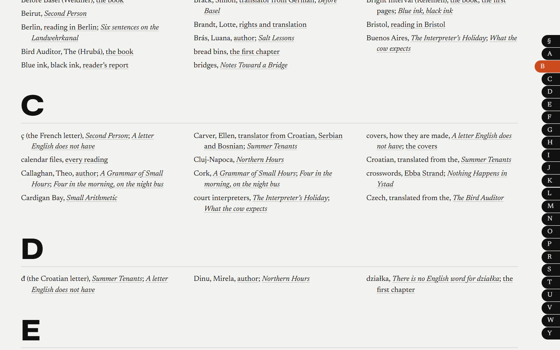
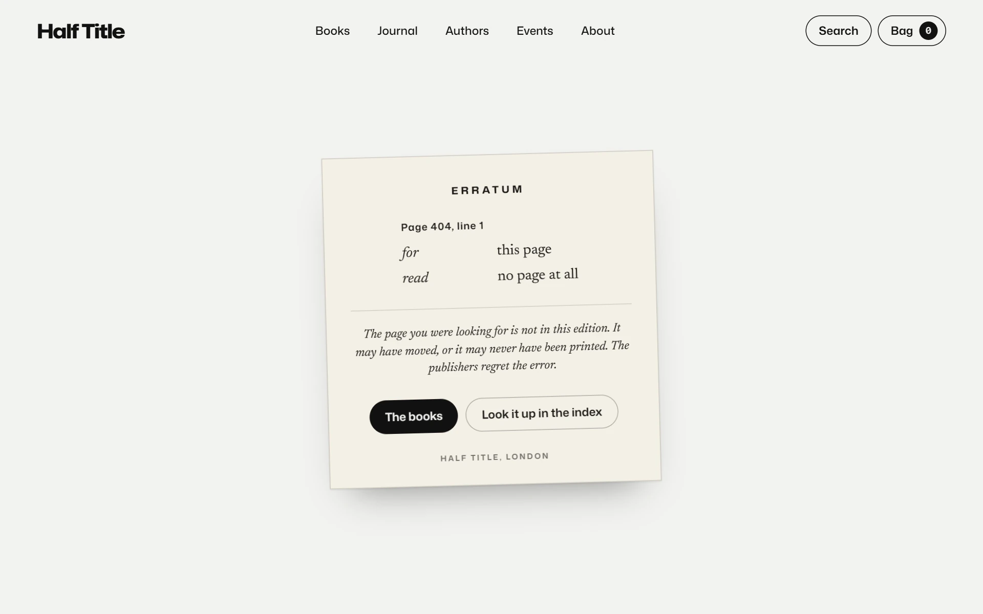
Books filtered by their letters and sorted by season, language, colour or length, each cover printed as it scrolls in. Authors and translators, a book to a row, meeting at the language. Search set as a book's index, with thumb notches down the edge. And a missing page, which gets an errata slip.
- 08
The same press on a phone
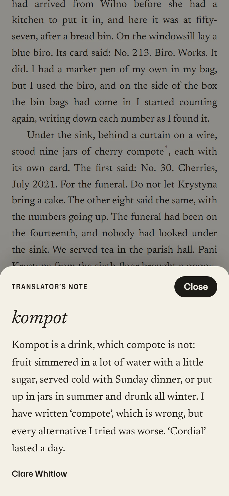
On a phone the translator's notes open as a sheet from the foot of the screen, the open book pans across to show the left-hand page before it turns on, and the calendar stands above the evening it is for.
Build notes
How we built Half Title.
The covers
There are no cover images. Every cover is set in code from the book's data: author, title and translator in Newsreader on one coloured stock, and the book's letter overprinted in a second ink with a multiply blend, so the title still reads through it, darker where the two inks cross. On the dark stocks the letter goes down first as a light ink. Every size is in container units, so the same cover is a thumbnail in the bag and a whole page in the open book.
The paper's grain is fractal noise, drawn once to a small tile. Drawn live as an SVG filter, it cost up to half a second each time a cover was repainted inside a 3D scene.
Between pages
There are three ways to change page, each taken from print. Between sections, a press sheet rises over the page with crop marks, registration targets, a colour bar of the fourteen cover stocks and the next page's half title on it; the page changes behind it and the sheet lifts away. It is a script rather than a View Transition, because it has to wait until the next page is ready.
A cover in a list flies to its place on the book's page, and the next and previous books and Journal pieces turn over like leaves, both through React's ViewTransition. “Keep reading” grows the book's first page until it is the reading room's paper.
Open the book
The book is a pinned stage and one render function that sets transforms from the scroll. Each leaf is two faces back to back, turned about the spine in 3D, so nothing is drawn per frame but transforms and opacity. The cover is never scaled, so its type stays sharp: the slot it starts in is exactly one page of the open book.
On a phone only one page fits, so after the third leaf the view pans across to the left-hand page, the imprint, and back before the last leaf turns.
The reading room
The text is marked up once, on the server: a note, a line to underline, an italic. Notes are positioned against the text column but left where they fall, so each sits level with its line with no script to place it; only notes that would overlap are pushed down. A folio mark goes in wherever a printed page of the book would end, and the folio at the foot counts them.
Cards are drawn on a canvas in the cover's design, the line set as large as it will fit, and saved as a PNG, or shared from a phone. The text size and the page you stopped on are remembered in the browser. At the end, the pages you have read swing back over the spine as one block, and the book shuts on its cover.
Type
Two typefaces. Mona Sans sets the site across its width axis, condensed for labels and expanded for display, and the Journal's lens moves each title along that axis as it passes. The lens measures every title before it changes any, so the page is laid out once a frame rather than once a title. Newsreader sets the books themselves: the covers, the reading room and the letters.
One canvas each
The heaviest scenes are each a single canvas, redrawn from the scroll: the home page's departures board of readings, copied flap by flap from a sprite sheet; the band of tiles that turns over into the footer; and the About page's press sheet, which redraws its type at the size you see it, so it is sharp from a single page to the whole sheet, and draws type too small to read as grey lines.
Keeping it fast
It is a static export of 42 pages. Each loads about 245 KB of compressed JavaScript, React, Next.js, Motion and Lenis included. The photographs are AVIF at two widths, about 80 KB at 1,200 pixels, with WebP behind them, and each starts as a two-ink duotone made when the site is built rather than a live blend mode, so scrolling never repaints a picture.
Every scroll scene was measured holding 60 frames a second at 1.5 times pixel density, and the layout was checked at seven screen sizes from a 320-pixel phone up.
Accessible by default
The bag, the note sheet and the card are dialogs that close on Escape and hand focus back. Changing the text size and opening a note are announced to screen readers, and the open book captions each page as it turns.
With reduced motion switched on, the press sheet, the flights and the turns give way to a quick fade, and every scroll scene shows its finished state.
Shipping it
Cloudflare serves it as a Worker with static assets only: no server code, just the files the build writes. A response header keeps it out of search results, because a press that publishes nothing has no business in them. This page is the one meant to be found.
What it doesn't do
The honest list. A concept is only useful if you know where it stops.
- Nothing is for sale. The bag works and remembers what you add, but there is no checkout.
- The press, its books, authors, translators, prices and readings are invented. The calendar files are real; the evenings are not.
- Only the lead title has its whole first chapter. Seven more books have their first pages, and the rest show their first page inside the open book.
- The photographs are from Unsplash and credited on the site. The places are real; the stories set in them are not.
- The submissions form checks what you type and sends nothing.
Under the hood
Start a project
Want a direction like this for your brand?
Half Title is invented. Yours wouldn't be: we build the direction around your brand, your products and your content. A paragraph is enough to start. You will get a real reply with an approach, a fixed price and a timeline — not a calendar link and a discovery call.